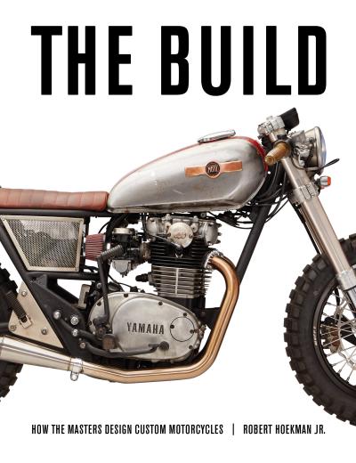
Design Zen

Custom motorcycle design is not something that lends itself to rules. In fact, one could argue that the most important factor is breaking the rules. During research for the book, author Robert Hoekman Jr interviewed some of the best and brightest custom motorcycle designers--including Maz Hazan, Alan Stulberg, the DelPrado brothers, and John Ryland--and discovered some basic concepts any motorcycle design should follow.
Given the diverse perspectives offered by the motorcycle builders featured in the book, The Build (Octane Press, June 2016), you’d expect them to have very different beliefs about design. While each has distinct opinions, all are very much built atop a few commonalities.
Start Anywhere
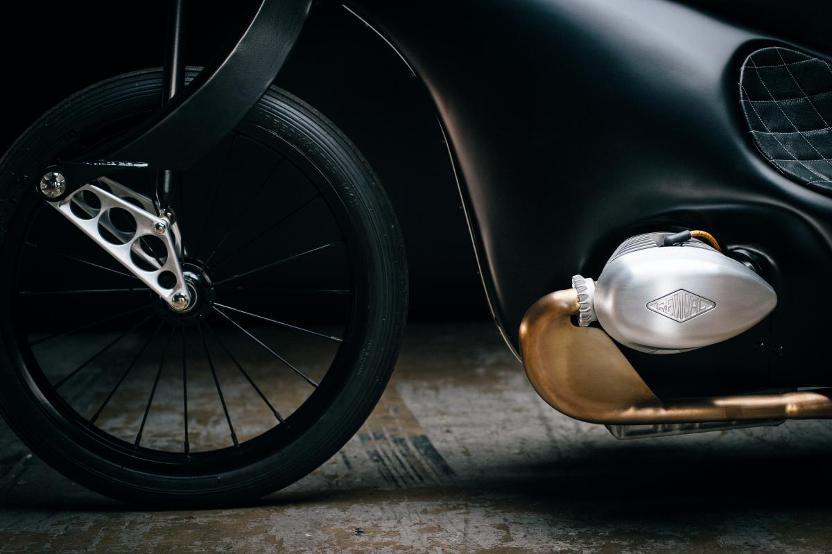
First, although you might expect to walk over to the desk at a custom shop and find a stack of sketches, equations, and colored pencils, for our builders, this is not the case. Rather, they say, motorcycle design tends to happen organically. It can develop around a single part, and you never what part that might be. “It can start with anything,” says Max Hazan. For him, it was once a headlight. On another occasion, it was the rear tire from an old Indy car. But, he says, “It usually starts off with an engine. I think, ‘I’d love to build a bike around that engine.’ I put the engine on the table and I kinda look at the engine and see what wants to go around it. What shape the bike should take.”
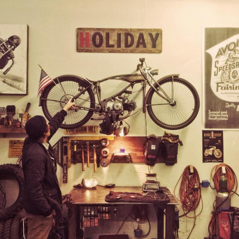
By all appearances, motorcycle design is more cooking than architecture. Just as a capable chef can build a delicious, unique meal around a single ingredient that happens to be in stock that morning, a motorcycle builder can, and often does, rely solely on his wits to get him to the end. Rather than pages of planned, perfect lines, most of the builders featured on these pages navigate their way through one choice at a time, are often surprised by what happens along the way, and are thrilled with how it comes out. It’s not usually clearheaded vision that guides the process. It’s more seat-of-the-pants decision-making. Like riding itself, it’s present. It’s immediate. It’s now.
When it comes to up-front planning, Stulberg is the standout. “I’m thinking about the end before I start,” he says. “I have lots of sketches on napkins. But then many details change midstream because this makes more sense than that.”
Embrace the Constraints
Second, there’s no such thing as a blank canvas. “You start with a set of constraints,” says Stulberg. “All we do is solve problems based on an aesthetic preference.”
It’s important not to see this as a downside, however. Design in any medium requires constraints. It’s the things you can’t do that dictate what’s possible. For example, a motorcycle wouldn’t be a motorcycle if it had four wheels and wings. By putting a motor on two wheels to create something you can safely call a motorcycle, you’ve ruled out billions of possibilities. It’s a good thing.
Then there’s the challenge of dealing with exposed parts, something you don’t have to consider so much with a car or a house. “Motorcycles are great—especially vintage,” Stulberg says, “because they have to wear their design on the outside. The tires, the chain, the suspension—it all has to be out in the open, and if you want the bike to be pleasing aesthetically, all of that has to be taken into account. I don’t think they’re that difficult, though, because you’re still dealing with the fact that you have two wheels, it needs to fit a human body of general size, and it has to have a certain function.”
In other words, it’s not like staring at a blank piece of paper in a typewriter for hours on end, panicking over what words to write. With constraints, you have a place to start.
The DelPrado brothers begin their customer conversations by narrowing down these constraints. They start with the “ergonomic riding requirement” of the person who will ride it—the person's height, weight, as well as riding style and frequency. For their Rusi bike, based on a modern Triumph Bonneville, the customer requested they build whatever they most wanted to build. Even then, Jarrod tried to find the edges: “He said he was going to ride the hell out of it on the streets of New York. So right there, we knew we wouldn’t be doing a hardtail.”
Aim for Clean
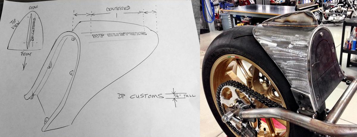
Third, clean design is good design. Spend a little time reviewing any design considered high quality, and you’ll almost invariably find it is composed of only the most necessary elements, arranged and presented in their best form. Sticking to this principle will help keep you out of danger. It’ll keep you from tacking on that extra gadget that doesn’t need to be there, from using one paint color too many, from landing on the side of garish.
“Try to say as much as you can in as few words as possible,” says Max Hazan, channeling Ernest Hemingway. “Use one line when one line is all you need, but make that one line as pretty as you can.”
John Ryland echoes that perspective: “It’s sorta hard to argue with a motorcycle that looks like everything is serving a purpose, but is all neat and tidy and looks athletic and really capable.”
No matter how complex the bike at the beginning of the process, stripping away the layers to reveal the simplest form of the machine invariably makes it a more beautiful thing at the end.
When in doubt, minimize. Be ruthless about it. Whatever is left, make it look as good as you can.
The act does come with its challenges, however. Simple can be hard to build. As Hazan points out, “I make things hard for myself because I think of these designs that are super-minimal and really clean, and those are usually the hardest to make.”
Try not to see it as a blocker. Overcoming the challenges will make the end result all that much more worthwhile.
Form Follows Function, Sometimes
Finally, the way a bike looks is intrinsically tied to the function each part provides. And the way these parts function together, to some extent, dictates how the bike will look. Their shape, their fit, their position, their style—all of these things contribute to the motorcycle’s appearance.
Max Hazan sees this throughout history: “On all the really classic bikes, all the bikes that have been iconic, it’s been one hundred percent form follows function. I’ve found that when form follows function, it usually looks aesthetically pleasing. A part that’s shaped to function looks good inherently.”
When the parts come together to form the whole, he says, “You could have a really busy design, but as long as the pieces function, it doesn’t look cluttered.”
The axiom is not, however, a universal truth. It depends on what you’re trying to achieve. For some of our builders, for instance, beauty takes priority. Jared Johnson explains, “There’s a lure to bikes being messy and dangerous and not so polished and smooth. I would rather a bike look really sexy than have all the proper parts. I still always put front brakes on my bikes. But I would rather build a rolling piece of art than something that’s more about function.”
It can also depend how you’re going about the process. Hazan’s designs tend to come from functional shapes. He doesn’t dream up a bike “that looks like a rose petal”—he conjures up functional parts that fit into some aesthetic idea and then works backward to figure out how to make them. “Form does follow function,” he says, “but a lot of the time function has to follow form for me, too.”
However you get there, your voice will come out. A maker will almost always inject a unique style into the things he or she makes because people, in small and endless ways, are inherently unique. We have distinctions. We have nuances. Yours will come out no matter what. Copying elements is by all means encouraged—every creator finds new ideas through copying others—but if you forego the urge to design every single detail just as someone else already has, your individualism will come out. You’ll see yourself in the result. Others will see you there as well.
You can’t argue with that.
This excerpt is from the book, THE BUILD by Robert Hoekman Jr. Meet the author and get the book at THE BUILD LAUNCH PARTIES May 14 & 20, 2016 in Austin, Texas and Phoenix, Arizona.
